

Recently I have been coding much more thanks to my ongoing research. As such, I have been working extensively with data and R, an open-source programming language used for statistical analysis of big data and even machine learning. I first began working with big data sets and R about three years ago when I went to work at the WHO. On my first day I was given a ‘big data set’ containing 350,000 individual cases of data with about 300 variables collected on each case. That’s 105 million individual ‘objects’, or pieces of information, to deal with. Naturally, I tried to open this in Excel… That didn’t go particularly well as my computer attempted to load the data for about 20 minutes and then crashed. R was built for this very issue; it was built to manipulate huge spreadsheets of information and quickly and powerfully apply functions to the data. Over the past three years, I have consistently built on my skills with R and statistics, even dipping my toes into machine learning and computer vision. Yesterday, I had a thought—I downloaded a dataset on COVID-19 and gave myself an hour to draw out some interesting patterns. So here is the result of this challenge!
First, I started by cleaning the data and removing any missing data. Thankfully this was a WHO dataset so it was mostly cleaned with little missing data (~1%). Missing data is a substantial issue in data science, however it often holds a lot of value if the analyst is curious. It might be tempting to simply discard cases with missing data in them as it would certainly make for a easier data set to handle. However, if we analyse missing data we can often find patterns. In a previous research project I found that individuals’ co-morbidities were missing from about 20% of cases. 20% of cases is an enormous amount of data to discard, so I delved deeper into this missing data. I discovered a statistical relationship between individuals who had died and missing data in their co-morbidities. It seems that scientists had frequently missed entering the patients’ co-morbidity data when the patient had died! Is this same behaviour replicated for individuals who have died in hospitals from other diseases? If so, what impact does this have on our record keeping and patient notes contained the NHS? This pattern of data is called ‘Missing at Random’, and is a very important trend to look for as it often holds clues to interesting patterns. Missing data holds meaning!
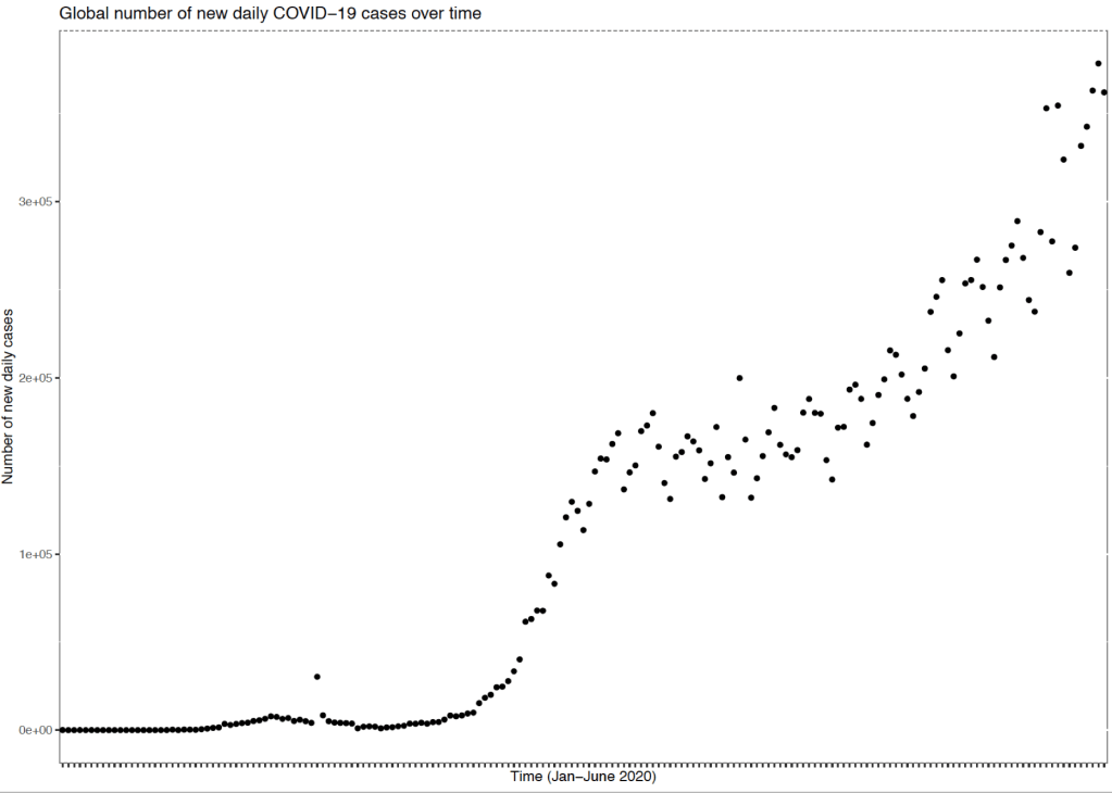
The next step with data is to plot and visualise the data. Here I had country-based data with daily information on a range of COVID-19 metrics between January 2020 until today. First I aggregated all of the country-level data by date and then used a simple plot to visualise the data. It can be seen from the graph above that there was an initial spike in global cases around March-April. Around this time many societies were locking down and introducing strict containment measures which reduced the rate of increase in new cases globally for several months. However, it seems that recently as economies and societies reopen there is an increasing rate of the number of cases once again globally. On a country-wide level this goes some way toward explaining why some cities such as Berlin, Leicester and some states in the US are re-imposing new lockdown measures.
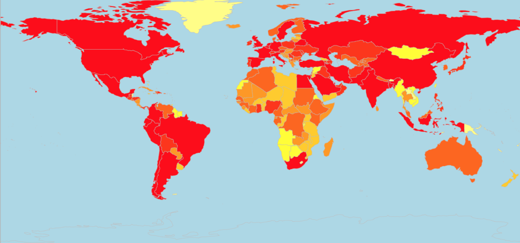
This next map (Figure 2) is one of my favourite visualisations to work with as the heat map shows the countries most affected in red and least affected in yellow. This graph, whilst simple to make, is visually striking and shows that that really no country has escaped cases of COVID-19. Some regions such as in south-west Africa and parts of Asia seem to have the fewest number of cases so far, however as we can see from Figure 3 below these are the regions with quickly growing rates of new cases.
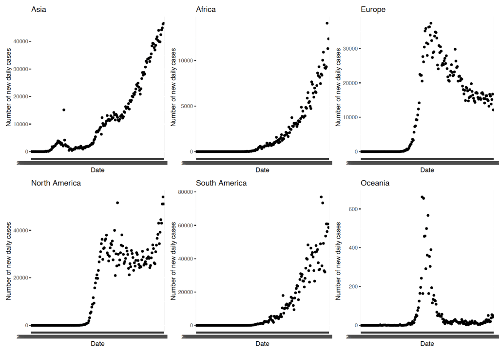
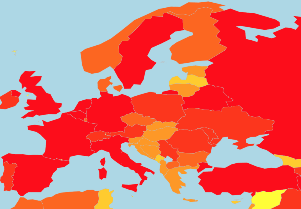
There are some (tentative) success stories, though. Europe was hit early and hard by COVID-19 cases, with surges seen early into the pandemic in Italy and Spain. Much of western Europe has subsequently been affected by huge numbers of COVID-19 cases as can be seen by the swathes of red in Figure 4. The number of new daily cases is now falling in Europe (Figure 3), which is cause for some relief. However it must be remembered that, as shown in Figure 3, there are over 10000 new cases each day in Europe alone, so we are still some way off from full virus suppression. Oceania seems to have done remarkably well as a region due to early and aggressive measure of lockdown and containment. This has been pivotal in reducing the spread of the virus and in stopping the exponential growth in COVID-19 cases seen in other regions.
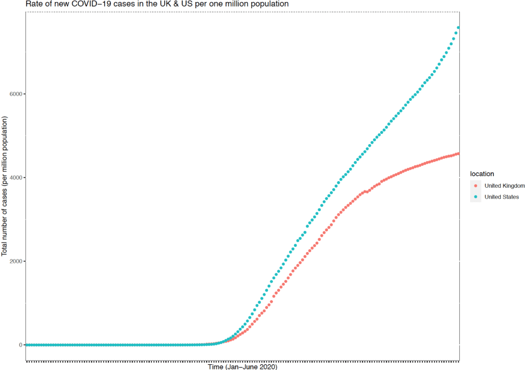
Finally, the US re-opened its economy and society far earlier than the UK. President Trump had signalled that society would reopen for Easter weekend and whilst this was widely disregarded, some states decided that churches could reopen on Easter Sunday. Since then, some states have progressively reopened their society. Subsequently there have been new recorded epicentres in the US and the rate of new cases continues to grow with an uptick in the rate of growth in the past fortnight. Comparatively the UK has thus far stabilised the growth of new cases and the total number of cases (per million population) seems to be plateauing. This is positive and has been reflected with the opening of shops and restaurants in England and the more tentative re-opening of public spaces in Scotland.
We have managed to find some interesting trends in that one-hour challenge. There is a huge amount of untapped potential within data, as I hope you can see. This was a really fun challenge—I enjoyed the speed element of it and I had to learn some new techniques along the way (including advanced formatting!) within the hour. I might repeat this challenge in the future with new datasets. Please let me know if there are any particular topics that you might be interested in digging into the data about.
